Thursday 12 January 2017
Advanced Portfolio Question 2: How Effective is The Combination of Your Main Product and Your Ancillary Tasks? - Connor Hilton
To answer this question I have created a short video. Here is the transcript for that video:
Firstly, I am going to discuss how we
marketed our short film through the use of our poster. Posters are a good way
to market a film as they can be designed to communicate meaning to the audience
while also catching the attention of a possible audience. To ensure that my
poster would be designed with the correct conventions and also catch the
attention of the audience I conducted some research on other short film posters
along with a poster from a UK Independent film. From this, I learned which
conventions to follow when designing my poster and techniques that catch the
attention of an audience.
When designing my poster, I thought about
the shooting locations that we had used and decided which would be a good
background for a poster. I decided that the shooting location of the bridge
road would be the best area to take an image for the poster. I decided this as
there isn’t very many distracting things such as parked cars that would take
away the focus of the protagonist in the frame. This means that the main focus
of the image is the protagonist in the middle of an empty road. The image also
emphasises the title of the short film because there is nothing around the
character in the frame. I feel that this made my poster appeal to our target
audience as you can see the protagonist in alone in the frame which could be
relatable to some members of our target audience. Also, the character is in all
black clothing which presents the theme that he has become depressed due to the
loss of his friend.
Another decision that I made when creating
my poster was the font for the title of the short film. I had to use a font
that could be read from a distance and was clear, because of this I chose the
font Agency FB which looks like this (point to area in frame). I also made the
text very bold and made the spacing between letters quite wide so that the title
filled most of the top edge on the poster. The spacing between the letters
being wide also represents the theme of loneliness as each letter appears to be
alone. I also made the title black because it linked with the colour of the
protagonists clothing and allowed the text to be easy to read on the lighter
background.
Our film is an independent low budget short
film which means that we do not have the money to pay for an advertising
company to make a poster for the film. This means that we had to create the
poster ourselves, each member of our group created their own poster in 3
different styles.
I feel that it is important for the film
poster and the film itself to link together to create its own unique brand. To
accomplish this I have kept consistency between the two products when making
them. For example, I have used a the same font for the title in the short film
and on the short film poster, however I have changed this slightly by adding a
white edge to the text on the poster to make it easier to read from further
away and I have made the title slightly more thick for the same reason. I also
decided to take an image at one of the filming locations on the bridge road
which links with the film also.
Another way to promote a short film is a
review of the film. Reviews can be good or bad for a film, for instance if the
review writer gives your film a good review then it is good publicity for the
film and people will want to watch the film however, if they give a bad review
it gets the name of the film out there but people may not feel the need to
watch the film as the review writer said that it wasn’t very good.
Now, I am going to talk about the review of
our short film. We have no control over the review as it is written by Little
White Lies which means that the review is not aimed at the films target
audience because the target audience is 17-25 both male & female whereas
Little White Lies’ target audience is 25-35 and for the classes A, B and C1
which is considered middle class. This is because the Little White Lies is a
premium magazine so it is made to a high quality and the readers have high
expectations of the company. Because the magazine is made at such a high
quality, each one could be considered expensive when compared to other film
magazines. The average cost for a Little White Lies magazine is £5 whereas the
average for other film magazines is £2. Readers of Little White Lies don’t
throw the magazine away when they have finished reading it because each
magazine is themed with a unique art style that make each issue of the magazine
different. The language used in the review uses complex English but still
presents itself in a chatty format however they keep a serious tone to make the
points that they’re making about the film clear.
Working as a group, we managed to create a
review for our short film in the style of the Little White Lies magazine. The
main problem that we encountered during this process was using the complex
language like the review writers do for Little White Lies, this is because
nobody in our group was able to write at the degree level that the review
writers do. However, after some feedback we managed to fix some of the issues
and create a high quality review that would suit the target audience. We didn’t
give our film three 5 ratings as we do not believe that our film is perfect.
For anticipation we gave the film a 4, enjoyment a 3 and for in retrospect we
gave it a 3. We felt that these were accurate for our film and depicted the
level of our short film well. We made sure to keep the same layout that Little
White Lies uses to make the review even more similar, we made sure to use the
same font sizes, styles and colours as well.
Here is the video:
Advanced Portfolio Evaluation Question 4: How Did You Use New Media Technologies in The Construction, Research and Planning and Evaluation stages? - Connor Hilton
To answer this question I have created a Prezi:
Advanced Portfolio Evaluation Question 1 In What Ways Does Your Media Product Use, Develop or Challenge Forms and Conventions of Real Media Products? -Connor Hilton
All three of the media products that we have been assigned to create use key conventions. This means that we as a group need to be aware of the conventions of each media product so that we can incorporate them into our own media product. As we were creating our own unique film it was important to keep to some of these conventions but to also challenge some conventions to make our film stand out and not be generic. Other short films tend to challenge short film conventions in ways that work and separate their film from the crowd.
To make sure that I knew what the conventions for a short film were I conducted some research. In this research I analysed multiple short films, identifying any conventions used and themes in the short films. I conducted this research during the initial stages of the production so that I could be prepared when making my own short film.
The 5 short films that I researched are:


The target audience for 'The Fly' is 15 and above. I think this because the film contains violence that in not suitable for under 15's and it also includes violent comedy that will target most people above the age of 15. The audience may be predominantly male due to the amount of frustration and violence included in the film that is considered to be more male behavior, i'm not saying say that women wont enjoy the film, just that men may find the film more relatable and relevant.
The film is considered to be 'dark comedy' because of it's violence mixed with comedy such as the scene with the toothpick through the main characters lip.


From the short films YouTube video description: ""Identity" is a project made for the youth in schools.
Don't let society define your Identity, or to tell you who you have to be.
The truth is already inside of you. Don't lose who you are."
Conventions We Used:
 Our short film begins with an extreme long shot of the two characters walking towards the camera. In this shot the title appears above the two characters. The title links with the shot as the two characters are standing in a field with nobody else around. The title is also the same font as on the short film poster.
 We then have a panning long shot of the two characters walking through the woods. The camera appears to be in a bush which is a subtle detail that makes it look like the camera isn't there which makes this shot look more natural. It also acts as a blocking effect that makes the shot more mysterious. The protagonist is wearing brighter clothing than the 'friend' which symbolises him being happy when hes with his friend. On the other hand, the 'friend' character is wearing darker clothing which tells us that he is sad.
 There is then a OTS shot from behind both characters sitting and playing a game. From this shot it is more obvious that there is a contrast between the two characters as you can clearly see the two colours beside each other. The lighting on the main characters face is much brighter than the 'friend' characters face, which further connotates the contrast in mental state between the two characters.
 After a fade out and a fade in transition we see an OTS shot of the protagonist on the computer. It then cuts to a POV shot as the character reads the page. We see a news article that shows that the friend has died, this is made more clear because there is an image of the 'friend' character. The lighting in this shot is low key as the only source of light is the computer monitor, which makes the shot look more sad and symbolises the protagonists feelings.
 Later, there is a extreme long shot of the protagonist sitting at the top of a garden. The protagonist is wearing dark clothing now, which tells us that he is sad/depressed. This brings us thoughts of the character committing suicide as the character is sitting fairly high up even if it's not high enough to seriously injure the character.
 The location changes and we get a long shot of the protagonist walking in the woods. The shots get shorter and shorter as the character approaches where camera originally filmed the long shot from. In a POV shot we see that somebody is approaching the protagonist. We then see that the character approaching the protagonist is the 'friend' character. The protagonist acknowledges the person without realising that it was his friend. We then see the friend character disappear behind the protagonist. This tells the audience that the protagonist is starting to see things. Both characters are wearing dark clothing which continues to tell us that the characters are depressed. The lighting is also low key which adds to the sad feeling of the sequence.
 After the character has got home, there is a sequence of close up shots showing the character talking to somebody on Facebook. This tells us that the protagonist thinks that he has found a new friend.
 There is then a long shot of the character on the side of the road on a bridge. This is the location that he agreed to meet the person that he was talking to on Facebook. This is an interesting location as the character was feeling depressed and bridges could be an indicator of suicide. This seems like foreshadowing via the location. The character has changed into some brighter clothing again which makes him seem happier. Lastly, the lighting of this shot is natural but it is bright because the sun is out. This makes us think that this part is happy and conveys the characters excitement to see his friend. The person from Facebook doesn't show up and the character becomes sad again.
 Lastly, there is a sequence showing the protagonist walking on the side of a busy road. He is wearing all black clothing which makes him look depressed. We then get a final close up of the character after he has stopped at the edge of a kerb. The character doesn't look happy or sad, just content. This tells us that the character is content with the decision that he has made. There is a cut to black and a diegetic sound effect of a car braking heavily. This tells us that the character has stepped into the road. This leaves us questioning whether he actually got hit by the car as there is no sound indicating that he got hit.

Here are two of the posters that I analysed:
Poster Research #1:
 Organised Criminal Synopsis:
When an ambitious up and coming criminal (Bobby) decides to get even with a vicious drug dealer from his past (Dominick), he realizes that in order to do so, he has to level the playing field first.
Through the use of modern technology and slick spying techniques, Bobby successfully blackmails the local Lt. Governor (Ryan Holt). Having Ryan Holt at his beck and call simply adds one more person to Bobbys growing collection of blackmailing files, so precious to him that they are stored and protected in a hidden vault.
Realizing that his blackmailing files are his true source of power, Bobbys choice to target to even higher levels of blackmailing victims leads him to pursue a partnership with his old friend and attorney, the very sophisticated, very well-connected, and yet very reluctant, Vincent Russo.
Bobbys task is to persuade Vincent that surrendering to his own greed without fear and without regard for his morals will lead them both to creating one of the most intelligent, most modern and most powerful criminal organizations the world has seen yet.
MRANG Concepts:

Structure:
What I learned from this poster:
I learned some of the conventions such as having a billing block at the bottom of the poster and having awards that the film has obtained. However, the poster doesn't follow other conventions such as having a large title which is odd.
 Lure:
Lure:
Quick explanation of story(from Lure's IMDB page):
James is a normal 13 year-old. When a cute high school girl flirts with him, he's thrown for a loop. She wants him to come back to her house for a good time, but the boy is nervous. Something just doesn't seem right.
MRANG Concepts:

As you can see I have added numbered arrows to the poster so I can be clear about which part of the poster that I am discussing.
This short film poster is structured in a very simple and effective way. This is because the background image is very blank and bland. There is also not much going on in the foreground image of the female characters hand except for the lure on a string. This structure emphasises the prop of the fishing lure. The image of the hand and the title are side by side which means you might see one after another so you associate that image with the title. There is nothing but the hand at the top of the poster which emphasises the image of the hand further.
What I learned from this poster:
I learned that composition of you background image is important. You need to leave room in the image for the title of the poster and for other details about the film. I also learned that the image for the poster should be relevant to the title and represent the title itself. However, this poster is missing some of the details that should be on a poster such as comments from reviewers.
Summary:
Because I have looked at these posters and analysed them, I have noticed the conventions that they are missing. This allows me to be more aware when creating my poster, to make sure that I include the conventions that I need and are relevant.
As a group we all created a poster for the film. These poster were created in different styles so that we could see a variety of options when deciding which poster to submit. Here are the conventions that my poster follows:


I decided to make my poster in the landscape orientation as this is more conventional for short film posters. This is because it allows more space for the image in the poster and leaves room for the other text on the poster. It is harder to create a new design for a portrait poster because there isn't as much room to work with.

Main Page:
The main page that the review is printed on is not the A4 standard size but is instead 245mm by 195mm.
 Image:
For the image of the poster, LWL takes a screenshot from the film it is reviewing. We mimicked this and then edited the image to the size on the page (77mm by 168mm . We created a box for the image on the template and then added the image.
 Title:
The title of the short film is printed below the image in the center. In older editions the title would be aligned to the left of the page, however they LWL changed this in their newer editions.
Film Information:
The film information, such as the director, is listed below the title in italic. The information is also in the Aparajita font.
Content:
The content is split into 3 different columns and the end column contains the reviewers scores for the film. LWL has three ratings for each film: Anticipation, Enjoyment and In Retrospect each is given a rating of 1-5.
 Language:
The language that is used in the review for LWL is sophisticated English. The style of writing can vary depending on the reviewer, sometimes it is chatty and other times it is serious throughout. The language is usually at a university degree level of English. This means that it is challenging for us to re-create this content.
 We made sure to follow the design dimensions of the LWL review and to use the key conventions of the review. These conventions include:
To make sure that I knew what the conventions for a short film were I conducted some research. In this research I analysed multiple short films, identifying any conventions used and themes in the short films. I conducted this research during the initial stages of the production so that I could be prepared when making my own short film.
Short Film Research:
During the Research and Planning stage of the production I conducted research into 5 different short films. Each member of our group had to conduct research into at least 5 different short films to ensure that every member of the group was aware of the conventions for a short film.The 5 short films that I researched are:
- 'The Fly' -Olly Williams
- 'The Arrival'-Zen Design Studios
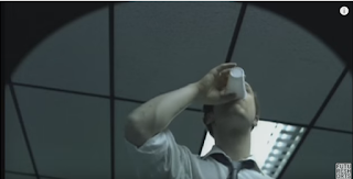
- 'Identity' - Babak Anvari
- 'The Black Hole' - Phil Samson & Olly Williams
- 'Too Quick To Judge' - Maaz Khan
- Usually no longer than 10 minutes
- Usually contain a twist or shock ending
- Always original work
- Low Budget:
- No Hollywood actors or big name actors
- Small amount of filming locations
- Usually only a few main characters
- Some deal with every day situations and make them more dramatic so it relates to their audience
- Others deal with quite unrealistic situations or realist situations with a slight twist in reality.
Short Film #1:
'The Fly' by Olly Williams Research by Connor Hilton
The films synopsis (from www.theflyshortfilm.com):
A
getaway driver waiting outside a bank robbery has three nerve shredding
minutes to get through before his crew returns. All he has to do is
focus…
The
Fly is a story of karmic revenge. A cat and mouse game where nobody is
really sure who is playing the cat, and who should be attending anger
management sessions.
A
tough looking guy sits at the wheel of a getaway car outside the closed
doors of a small town bank. He is tense, nervous, and checks the doors,
checks his watch, chews his toothpick like he thinks he’s in a film. A
helicopter flies overhead, a siren in the distance, he checks the
surrounding area nervously. As he drums his fingers on the wheel a fly
buzzes out of the sky and lands on the windshield right in front of him.
He freezes and stops chewing his toothpick. Like a cat on the prowl he
carefully lifts his hand and taps the windscreen wipers on. Sqwueeek…
the Fly is gone. The driver grins to himself and settles back into his
seat, cracking his knuckles.
From
the ominous locked doors of the bank, we hear the violent bloodcurdling
sounds of a bank robbery in progress. Gunshots are fired, people scream
and beg for mercy. Back in the car the fly returns with a vengeance to
torment the hapless driver. A comically violent and unbalanced game of
cat and mouse ensues, leaving the driver a quivering blubbering nervous
wreck. With the rest of the bank crews arrival imminent and the police
closing in, will he keep his resolve long enough to do his job and make a
clean getaway?
Concepts:
The 3 concepts that I am going to apply are:
- Representation
- Audience
- Media Language
Representation & Media Language:
- The Fly covers a group of gang members attempting a bank robbery.
- We are introduced to one of the main characters which is the driver via a close up opening shot.

- The man is tapping his finger indicating that he is waiting for something.
- The man is also wearing a black leather jacket which is typical for this 'gang member' style.
- He is also chewing on a toothpick which is an act that is iconic in violent characters.
- There is then a mid shot showing the man in the car and a fly on the windshield after a diegetic foley of a fly.

- This is the first time we see the fly character.
- Although the fly is an insect it is the antagonist as it is stopping the main character from focusing on what they are doing.
- The man then uses the windshield wipers to get rid of the fly and all appears to be dealt with.

- Next we get a slow dolly shot of the bank doors.
- In the background we can hear muffled diegetic sound of the other gang members inside the bank shouting at the people inside of the bank to hand over the money.

- We then get a similar shot to the first shot of the fly on the windshield however, this time the fly does not appear in the shot, but we know that the fly is there because of a diegetic sound effect of a fly.
- After this, the man searches for the fly inside of the car and begins to attempt to swat the fly around his head.
- This continues to happen as the man gets more and more frustrated at the fly.
- Eventually the man ends up injuring himself by hitting the toothpick so that it goes through his lip.
- The man then proceeds to go on a shooting rampage to attempt to kill the fly, damaging the getaway vehicle heavily in the process.


- Lastly we get a long shot of the other gang members leaving the bank and seeing the aftermath and we get a diegetic sound of police sirens approaching. The driver and the gang members realize that the plan a been foiled and that they are going to get caught, all because of a fly.

- The driver represents anger as he is getting very frustrated to the point of damaging the car.
- The Fly represents an underdog type of character as it is a tiny insect figuratively standing up against a big man.
- I feel that it is a negative representation of the gang member group because the man becomes so frustrated that he extremely damages the car and himself because of his stupidity, impatience and frustration.
Audience:
Target Audience:
The target audience for 'The Fly' is 15 and above. I think this because the film contains violence that in not suitable for under 15's and it also includes violent comedy that will target most people above the age of 15. The audience may be predominantly male due to the amount of frustration and violence included in the film that is considered to be more male behavior, i'm not saying say that women wont enjoy the film, just that men may find the film more relatable and relevant.
The film is considered to be 'dark comedy' because of it's violence mixed with comedy such as the scene with the toothpick through the main characters lip.
Things I learned from this short film:
From this film there are a few conventions to notice. At first glance, this is not an every day situation, however adding the frustration of the main character from the fly it becomes an everyday situation. This means that films can hide an everyday situation in a story that isn't an everyday situation. I also learned that a film doesn't need a lot of filming locations to make it interesting as long as there is a recognisable narrative in that location. Lastly I learned that you don't even need more than 1 main character to create a relevant and interesting short film.Short Film #2:
'The Arrival' Zen Design Studios 2016Research By Connor Hilton
About the film:
A
character named Anna sits and waits inside a coffee shop contemplating a
big decision. The whole film is shot in one take and is narrated by the
main character. She is deciding whether or not to keep a baby and is
waiting for her partner to get there so she can talk to them about it.
Concepts:
- Narrative
- Representation
- Media Language
Analysis:
 |
| Title Screen |
As you can see, the title screen is very simple
yet effective, which relates to the film because it is shot all in one
take which is also simple yet effective when done right.
- In the first shot we seen Anna, the main character, come in through a frosty door into the warmth of a cafe.
- The waiter approaches her table and she orders a coffee, which we hear through diegetic dialogue.
- After a brief moment we here diegetic dialogue of Anna's voice, however, the voice is much louder and clearer so it is indicated that we are hearing Anna's thoughts.
- She thinks "I should've ordered a decaf or a tea...No it's fine", this is enigmatic as it makes us wonder why she wouldn't want a normal coffee while also showing indecisiveness. This furthers the plot.
 |
| Long Shot of Anna Entering Cafe |
- We learn that Anna is waiting for somebody and has arrived early, giving herself some time to think about what she is going to say "You...We made me pregnant", this is showing that she initially gave the man the responsibility and then corrected herself.
- We also learn through diegetic dialogue that Anna is pregnant and is deciding whether to keep the baby or not, this is a very political issue that many women struggle with in their lives so it is a feminine issue.
- This reveals the answer to the question as to why she thought she should have a decaf or a tea.
- As the film continues the plot becomes more enticing because more details are being revealed which attracts the audience into the film.
- It is also indicated that Anna planned on aborting the pregnancy, yet hasn't fully decided.

LS of Anna Contemplating her decision - Next, Anna begins to question the amount of time she has left.
- The camera slowly zooms in from the LS and the shot begins to shrink within the frame.
- This could relate to Anna's diegetic dialogue about time and how much she has left to have children and that amount of time shrinking.
- A younger couple enters the cafe and Anna watches as they walk to the counter holding hands, envious of what they have.

Mid Shot of Anna watching young couple


- Anna then begins to think about the other possibilities she has in this decision.
- We hear this through more diegetic dialogue "What if he wants to keep it?" , "We're not in love." and "I can't even remember what colour his eyes are...they're blue".
- All of this links to her being even more indecisive about the big decision that is faced by the social group of women all the time.
- Lastly, we see another mid shot of Anna, but, her eyes are locked onto something.
- Her body language is frozen and suggests she is uncomfortable.
- We hear a child's cry via a diegetic sound, revealing what she is looking at.
- Anna overflows her coffee with milk because she was focused on the child entering the cafe.
- After this disruption, she starts to think about what the baby will be like, indicating that she has now changed her mind and wants to keep the baby.
- We hear through diegetic dialogue "Will it be a girl or a boy?"and "What if it's twins?" which further suggests that she wants to keep the child.
Overview:
Narrative:
The
narrative is linear, Anna starts off with the mindset that she wants
to abort the pregnancy, however with the time she has to think, she
realizes that she may want to keep the baby. There are certain key
events that fit into the plot such as the young couple entering the
cafe, the child entering the cafe and her spilling the coffee as she
realizes that she may want to keep the baby. I don't however, feel that
the story follows Todorov's theory because there are parts of the plot
that are missing, there doesn't seem to be a final equilibrium, Anna
hasn't fully decided or discussed anything with her partner. This means
that the narrative is open ended, it leaves the viewer to decide what
happened.
Representation:
The
arrival shows some key examples of issues that face the social group of
women and young couples deciding to have a baby. The baby is the result
of a 'one night stand', which is another social issue that faces the
social group. It shows that the decision to keep a baby is tough and
should be thought about thoroughly.
What I learned from this short film:
From this short film I learned that short films can be created in just 1 take, it is hard to do and would take many attempts to pull off but when done correctly creates an effective short film. This film also shows the low budget as there is only one main character and all the other people act as extras. I also learned how effective the use of non-diegetic dialogue can be when it acts as the characters thoughts.Short Film #3:
The Black Hole Short Film by Phil Sampson and Olly Williams
Research By Connor Hilton
About the film(from the YouTube page): "A sleep-deprived office worker accidentally discovers a black hole - and then greed gets the better of him..."
Concepts:
- Representation
- Narrative
- Media Language
Title Screen:

Analysis:
- The film opens with an establishing shot to a close up of a male character at work.
- The setting is in an office.
- According to Todorv's theory this would be the equilibrium stage of the plot.
- The man is wearing a white shirt that has the top button undone which suggests that he has been working for a long time that day and is tired. This costume is also iconic to an office worker.
- His facial expression also shows that he is tired which tells the audience that he has been working late.

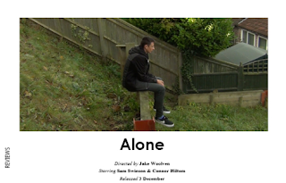
Close Up of male character - The male character is attempting to print something and becomes frustrated when the printer doesn't work.
- The man kicks the printer and the printer prints a piece of paper with a large black circle on it.
- The man takes a drink, but as he picks the cup up we cut to a low angle shot of him drinking the water from the piece of paper's position.
- This creates enigma as we are wondering why we are seeing this from the perspective of the paper.
- It also looks like the camera is inside the piece of paper instead of on top which creates the 'black hole'.
Low angle shot of man drinking - The man then sets the cup down on top of the black hole and notices the cup dissapears through the paper.
- The man begins experimenting with the paper by picking it up and putting his hand through it which represents the human curiosity.

Close up of man putting hand through paper - After the man discovers that he can put his hand through the black hole, her immediately looks up and straight at the vending machine
- He then uses the paper to reach through the glass of the vending machine to grab a chocolate bar. This begins to con notate the mans level of greed to the audience.
- At
this point the very humorous and fake concept of being able to reach
through things with a piece of paper becomes real to the spectators.

CU of man taking bite out of chocolate bar - There is then a pull focus zoom shot of a door with a 'keep out' sign on it.
- The lighting is low key which indicates that the door is off-limits for normal employees and is for the boss only.


 |
| Pull Focus zoom of the door |
- We then see a close up of the man using the black hole to unlock the door from the inside.
- He then proceeds to the safe and sticks the piece of paper to the door with some tape.
- He reaches inside and pulls out a stack of money.
- He smiles when he sees the money, it makes his face look creepy and shows his greed.
- Instead of stopping there, the man continues to pull money out of the safe until he has a pile of money.
- He begins going further and further into the black hole to reach the money.
- He then climbs right into the safe through the black hole.
- Once he is in the safe, the piece of paper falls off the door of the
safe leaving the man trapped inside the safe and the money left outside
the safe.
To conclude, I would show that 'The Black Hole' is conveying the message of greed and how it will come full circle back to you in the future. The film coveys this message in an effective way as it is comedic and light hearted which makes the audience laugh but also think about the deeper meaning of the film. The film also has no dialogue and uses lighting, facial expressions and creative angles to show what is happening and what the main character is thinking.
Mid shot of safe and money.

What I learned from this short film:
From this short film I learned how a good message can be conveyed through a short film. The film tells the audience to avoid greed as it won't be good in the end. This film also furthered my knowledge that you don't need many different locations to make your film diverse and interesting. This film also showed me that special effects can be acceptable as long as they look good and believable.Short Film #4
Too Quick To Judge Directed By Maaz Khan Analysis
By Connor Hilton
About The Film:
The
film is about a young man who comes across a woman sitting on a bench
in a park where he has come for a run. The young man tries to compliment
the woman on her drawing and she appears to ignore him twice before he
gets frustrated and leaves for a lap around the park when he returns the
woman has left a note.
From the YouTube Description: "A short-film that teaches us that we shouldn't be too quick to judge people."
Concepts:
- Representation
- Audience
- Media Language
Analysis:
- The film opens on a long shot of a female character sitting alone on a bench in a park setting.
- The female character is also wearing a short dress, like she could be dressed for a special occasion.
- The female character is drawing in a sketch book on the end of the bench.
- We then cut to a close up of the page in the female characters sketch book that shows she is drawing a woman in a long dress.
 |
| Long Shot of female character on bench |
 |
| CU of the sketch |
- A few seconds pass and a male character approaches and places his bag on the bench.
- The female character doesn't look at him at all as if she doesn't know he's there we see this via a 2 shot.
- The male character stretches, puts his headphones in and sets off on a run leaving his bag on the bench.
- The shot fades into another long shot of the female character indicating to the audience that some time has passed.
 |
| LS 2 shot of the two characters |
- The male character takes a seat on the bench with the female character and notices her drawing.
- The male character attempts to compliment the drawing, yet the female character doesn't reply or even look at him.
- This seems odd to the audience because the female characters body language is positive as she is sitting up straight with her arms open.
- The male character attempts to compliment the drawing a second time and the same thing happens.
- The male character begins explaining how he was only trying to compliment the drawing and that he wasn't interested in her and the female character doesn't even look at him once again.
- The male character stands up and begins packing things into his bag, the female character looks at him confused.
- The male character is complaining to the female character about how every girl thinks every guy is interested in them.
- The male character then leaves for another lap of the park.
 |
| mid shot of male character leaving |
- As the male character leaves the female character looks at him with a confused facial expression which we see via a close up.
- We then get an over the shoulder shot of the female character writing on her sketch.
- She then tears the page out, slides it under the male characters bag and leaves.
- This creates enigma as the audience is left to wonder what she wrote on the paper for a few seconds.
 |
| OTS shot of writing on sketch. |
- We see an extreme long shot of the male character approaching the bench.
- He looks around to see if the female character is still there and then notices the piece of paper under his bag.
- He picks the sketch up and sits on the bench.
- We get an over the shoulder close up of the sketch and the writing reads " Sorry if I offended you...I'm deaf."
- We then see a reaction shot of the male character and his facial expression shows regret and sadness.
- The film cuts to black and a quote appears on screen "Don't be too quick to judge".
Conclusion:
In
my opinion, this short film is trying to represent how quickly people
will judge someone and how assumptions can be made too quickly and can
lead to confusion and anger. It portrays this message to the audience
very well by hiding details and explanation until the end. The ending
can be predicted as it can be obvious that the female character was deaf
as her body language was mainly positive throughout the film. Some
people may have assumed that the female character was judging the male
character too quickly at the start of the film because she didn't even
talk to him but this is twisted at the end and can lead to the audience
being surprised.
What I learned from this short film:
This short film continues to tell me that short films don't need to have many locations to convey the story. It also continues to tell me that you don't need many main characters to create an engaging story. Additionally, I learned that an important message can be conveyed in a short film, for this film it is in the title and the message is don't be too quick to judge others.Short Film #5:
'Identity' Directed by Babak Anvari 2012 Research By Connor HiltonAbout The Film:
This short film is about a young teen girl in American high school. Everyone in the school is wearing masks, nobody's face can be seen. The girl gets distressed and uncomfortable because the mask is her fake identity and she wants to show her true identity.From the short films YouTube video description: ""Identity" is a project made for the youth in schools.
Don't let society define your Identity, or to tell you who you have to be.
The truth is already inside of you. Don't lose who you are."
Media Concepts:
- Representation
- Audience
- Media Language
Analysis:
 |
| Title Screen |
- We start with black screen, we hear some narration from a female voice "Today I found the truth".
- It then cuts to a close up of a female character staring at herself in the mirror.
- The female character then raises a mask. Which hides her face, giving her a 'new identity'. This indicates that the film is trying to portray the message that teenagers hide their true identity and only show a fake identity to others.
- She walks backwards out of the room, into a hallway and into a cafeteria. This indicates that what we just saw was a flashback and are now seeing the present time.
- Other students are also wearing the masks, however, they are split into groups. Nobody appears to have the same mask as the female character though which indicates that she doesn't 'fit in'.
 |
| CU without mask |
 |
| CU with the mask on |
- Next we see the female character inside a classroom with her classmates via an over the shoulder shot, all of them are wearing masks.
- We hear the teacher is telling a story of a group of people who
lived inside of a cave and had never seen the outside, and how one day,
one of the people saw the outside and became the enlightened one and had
to show the others. This foreshadows the end message to the short film.
OTS shot of girl sitting in class - The female character has left the class and is wandering down the halls.
- We see a close up of a poster that reads "THIS is what beautiful looks like.

CU of Poster - The girl in the poster is wearing a pure yellow mask with no detail, it looks generic and boring, this could relate to the real life glamour images where the models faces all look very similar because of the makeup hiding their 'identity'.
- It also represents how the media influences teenagers to look a certain way in order to be beautiful.
- We then cut to a mid shot of a group of female characters wearing the same yellow mask as the girl on the poster.
- This shows that these girls have been influenced by the media and have made themselves look 'beautiful'.


 |
| Mid-Shot of the group of girls |
- A few seconds later we see a different female character walk up to a group of friends while taking off one mask which reveals the mask underneath. This shows that people have different identities for different friend groups and have to act as someone else when with some people. It could also show that she is her more real 'identity' when with that group of friends and the other mask was an identity that she showed in class.
 |
| Mid Shot of girl taking off mask |
- Next, we see the main female character sitting in the original place in the cafeteria via a close up of her at the table.
- We hear a non-diegetic sound that reminds us of what happened at the start of the short film.
- The female character stands up and rushes to the bathroom, tripping when she gets through the door to the bathroom.
- After a cut to black we get an over the shoulder shot of the girl standing up and looking into the mirror.
- Her mask appears to have cracked and is missing some of it's 'face'.
- The female character attempts to leave the bathroom, but stops at the door and then walks back to the mirror.
- We hear a slow, happy & triumphant non-diegetic soundtrack as the female character removes the mask from her face.
- The female character stares into the mirror and smiles, she has realized her true identity.
- We then get more narration similar to the start of the film "Today the truth found me".
- The female character leaves the bathroom, while dropping the mask, and walks outside building facing her peers who stare at her in surprise.
 |
| LS of girl walking outside |
Conclusion:
Identity
is aimed at a teenage audience giving the key message to not be fake
with each other and to be your true self. It also represents teenagers
as generic and people who can be categorized into groups. It does this
by giving people who are friends similar masks which indicates that they
are all the same person. Additionally, the film highlights the way that
media tells teenagers to act and look and how some teenagers are
influenced heavily by this and hide their true identity. Lastly, I think
that the main message of the film is to tell teenagers to be themselves
and that it doesn't matter if you fit in with others because everyone
should be unique.
What I learned from this short film:
I learned that you can create a reality that isn't entirely the same as our reality that allows you to convey a message to your audience. I also learned that you don't need trained actors in your short film to create a believable story as this short film just uses people from the school.Our Film:
After doing all this research we planned and created our own short film. In our short film we decided to stick to most conventions, however there were conventions that we challenged/differed from.Conventions We Used:
- Our film is just over 5 minutes long
- No big name actors
- Small Cast-Only two characters
- One protagonist-Our film only uses 1 protagonist and his friend who is a normal character
- Protagonist solves issue-In our short film the main character attempts to solve the issue
- Realistic Issue-The protagonist is dealing with a serious and realistic issue
- No voice over- We didn't have a voice over in our short film
- Only some dialogue-The characters don't really talk in our film
9 Frame Analysis of Our Short Film 'Alone':


Short Film Posters:
Before I started to design my poster for the short film, I conducted some research into other film posters. I looked at 4 posters, 2 of them were for short films and the others were for UK Independent films. I did this research to identify the marketing techniques and conventions of a short film poster. I looked at the UK Independent films to see what makes them different from a short film poster. These are some of the conventions that I identified:- Main image reflecting the film, usually of the main character(s)
- Obvious title of the film in a relevant font
- Reviewers positive comments/ratings
- Awards from short film festivals
- Production company logos and website URL
- Billing block at the bottom of the poster
- Social Media links
Here are two of the posters that I analysed:
Poster Research #1:
Poster Research - Organised Criminal

When an ambitious up and coming criminal (Bobby) decides to get even with a vicious drug dealer from his past (Dominick), he realizes that in order to do so, he has to level the playing field first.
Through the use of modern technology and slick spying techniques, Bobby successfully blackmails the local Lt. Governor (Ryan Holt). Having Ryan Holt at his beck and call simply adds one more person to Bobbys growing collection of blackmailing files, so precious to him that they are stored and protected in a hidden vault.
Realizing that his blackmailing files are his true source of power, Bobbys choice to target to even higher levels of blackmailing victims leads him to pursue a partnership with his old friend and attorney, the very sophisticated, very well-connected, and yet very reluctant, Vincent Russo.
Bobbys task is to persuade Vincent that surrendering to his own greed without fear and without regard for his morals will lead them both to creating one of the most intelligent, most modern and most powerful criminal organizations the world has seen yet.
MRANG Concepts:
- Narrative
- Genre
- Media Language

- The short film has been selected to be shown at multiple film festivals which will make the audience consider watching the film as they are more likely to enjoy it. The audience will recognise the symbol for the awards/ film festival selections and this will instantly make them value the film more. This is why it important to list good accomplishments of your short film on the poster.
- The title of the short film is in the centre of the poster which makes it easy to see. It is also white on a dark background which makes the title easier to read. The font of the title is also iconic to the action/thriller genre and makes the text look more intense and impactful.
- This short film poster also has a tagline which is unusual for a short film poster and is hard to get right, as it may sound cheesy or cliche. In this case, I feel that the tagline is fairly generic but it does add to the poster and gives the audience a better idea of what the film is about.
- There is an image of a male character with a silhouette effect which creates enigma by using restricted narration as we can't see what the character's face looks like.This helps connotate the genre to the audience as restricted narration is iconic to the thriller genre. The character's costume is a white shirt which indicates he could work for a business.
- In the background we can see some images with text over the top, one of images displays a character lying on the bed with their arm stretched towards the camera which makes them look like they are dead. This helps connotate the genre to the audience.
Structure:
The
poster is separated into three sections. The top section has a black
background with white text on top to make the information stand out to
the audience. The middle section has the image of the male character in a
silhouette which provides a black background for the white title text
which allows the title to stand out. The bottom section contains the
billing block and is on a black background with white text which again,
makes the information stand out.
What I learned from this poster:
I learned some of the conventions such as having a billing block at the bottom of the poster and having awards that the film has obtained. However, the poster doesn't follow other conventions such as having a large title which is odd.
Short Film Poster #2:
Poster Research- Connor Hilton
 Lure:
Lure:Quick explanation of story(from Lure's IMDB page):
James is a normal 13 year-old. When a cute high school girl flirts with him, he's thrown for a loop. She wants him to come back to her house for a good time, but the boy is nervous. Something just doesn't seem right.
MRANG Concepts:
- Narrative
- Representation
- Media Language

As you can see I have added numbered arrows to the poster so I can be clear about which part of the poster that I am discussing.
- The title of the short film is 'Lure' which is a reference to the device on the end of a fishing rod's string which is used to attract fish to the bait. This is a good metaphor for the story line of the short film as we know that the story is about a girl luring a boy to her home. The title itself on the poster is not in all capitols so it has a more subtle impact and the title blends with the background instead of being a very bright colour which would contradict the feel of the poster.
- The short film has one an award which reads : "Official Selection Tribeca Film Festival 2006". This shows us that the film is of high quality as it has won an award and has been shown at a film festival. Showing that a film has won an award at a film festival is a useful tool as it can convince people that the film is worth watching.
- The billing block is located at the bottom of the poster. This is so that most people will read that part afterwards as most people would look at the poster from top to the bottom. This is a good location as the billing block can be hard to read which could put off some people, so having the billing block at the bottom allows people to get credited for the work while also being less intrusive to the whole poster.
- This is the main image of the poster. We can see a female characters hand holding the prop fishing lure on some string that is wrapped around her finger. We know that it is a female characters hand because of the red nail polish on her nails. The red nail polish can mean a few different things, it could be suggesting violence or it could suggesting romance which creates enigma for the audience. The image connotates the story of the short film of the female 'luring' the male to her house because she is holding the fishing lure and attracting the boy to her house like a fisherman would with fish.
- The lure itself has a hook on the end of it, which could signify that if the male character accepts going to the female characters home then he could be 'caught' or in danger of some kind. This could link with the colour of the nail polish as both of these could signify danger or violence.
Structure:
This short film poster is structured in a very simple and effective way. This is because the background image is very blank and bland. There is also not much going on in the foreground image of the female characters hand except for the lure on a string. This structure emphasises the prop of the fishing lure. The image of the hand and the title are side by side which means you might see one after another so you associate that image with the title. There is nothing but the hand at the top of the poster which emphasises the image of the hand further.
What I learned from this poster:
I learned that composition of you background image is important. You need to leave room in the image for the title of the poster and for other details about the film. I also learned that the image for the poster should be relevant to the title and represent the title itself. However, this poster is missing some of the details that should be on a poster such as comments from reviewers.
Summary:
Because I have looked at these posters and analysed them, I have noticed the conventions that they are missing. This allows me to be more aware when creating my poster, to make sure that I include the conventions that I need and are relevant.
Our Short Film Poster:
 |
| My Short Film Poster |
As a group we all created a poster for the film. These poster were created in different styles so that we could see a variety of options when deciding which poster to submit. Here are the conventions that my poster follows:
- Large title
- Reviewers Comments
- Billing block
- Awards from film festivals
- Social media links
- Background Image that reflects the title


I decided to make my poster in the landscape orientation as this is more conventional for short film posters. This is because it allows more space for the image in the poster and leaves room for the other text on the poster. It is harder to create a new design for a portrait poster because there isn't as much room to work with.
Little White Lies Review:
What is Little White Lies?
Little White Lies is a film magazine that is published on a bi-monthly schedule. It is an independent magazine published by The Church of London and is made in Britain. The Church of London also publishes a magazine named Huck which is about adventure and culture.
Who Reads Little White Lies?
Little White Lies is a film magazine which means that it is targeted at individuals with an interest in film. The age range of their audience ranges from 16-35 but the most of their audience is in the age range of 25-35 due to the sophistication of the magazine. The magazine is also made to a very high quality and each one has it's own theme. The cover of the magazine is representative of whats in that particular issue. The magazines are individually sold for £4.00 to £6.00 which could be considered expensive. This is why most of their target audience is in the middle class.Conventions of a LWL Review:
There are many things included in a LWL magazine, but we only created a review in the style of LWL.Main Page:
The main page that the review is printed on is not the A4 standard size but is instead 245mm by 195mm.

For the image of the poster, LWL takes a screenshot from the film it is reviewing. We mimicked this and then edited the image to the size on the page (77mm by 168mm . We created a box for the image on the template and then added the image.

The title of the short film is printed below the image in the center. In older editions the title would be aligned to the left of the page, however they LWL changed this in their newer editions.
Film Information:
The film information, such as the director, is listed below the title in italic. The information is also in the Aparajita font.
Content:
The content is split into 3 different columns and the end column contains the reviewers scores for the film. LWL has three ratings for each film: Anticipation, Enjoyment and In Retrospect each is given a rating of 1-5.

The language that is used in the review for LWL is sophisticated English. The style of writing can vary depending on the reviewer, sometimes it is chatty and other times it is serious throughout. The language is usually at a university degree level of English. This means that it is challenging for us to re-create this content.
Our Little White Lies Review:

- Main image (taken from the film)
- Bold title in the the center of the page
- Information about the film under the title.
- Content written at a sophisticated level
- Ratings for the film with comments
- 'Reviews' written in the Microsoft Yahei Font on the left side of the page
- Page number listed at the bottom of the page.
Subscribe to:
Posts (Atom)